Recoup
The Ask
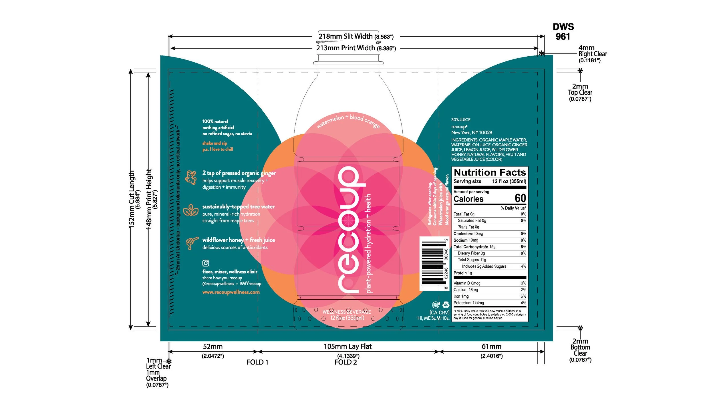
Recoup is a ginger-powered health drink for workout recovery and daily wellness that’s clinically proven to reduce post-workout muscle soreness, aid digestion, and boost immunity. Recoup was in need of a brand overhaul and, most importantly, an overhaul of their product design. So they hired us.
The Answer
We re-imagined Recoup’s foundational identity system – logo, palette, typography, photography – and applied it to the brand new Recoup bottle design. We developed a vibrant, regenerative identity based on perfect circles. It was a challenge to stand out on the shelf in an incredibly saturated health drink space, all while keeping it classy.


file under
Branding, Identity design, product design.
CREDITS
Concept by Jonathan Campo
Art Direction by Jonathan Campo and Missy Bruno
Creative Direction by Jonathan Campo and Henry Mathieu
Agency Gravy Boat Regatta